This case study is framed around the non-profit organization, Save-A-Life Pet Rescue. They are a dog shelter that aim to rescue dogs from high-kill shelters. Unfortunately some dogs end up overpopulating a shelter or if they are undesired for too long, they end up reaching their end. They come into the story to have those dogs find their new "forever home."
They have a website, however they don't use it often as they have pushed more to be on Facebook, using Facebook Pages as their main site/method of communication for information. My team and I chose to target their actual website which has not been convenient for the average user.
Truth to be told, it was difficult to start on what the organization wanted to do with their dated website. As you, the reader, go through this case study. You will see the case started originally to be an adoption site with the idea of having Petfinder, a website designed for helping adoption centers from all over the US to help their animals find their homes. As my team continue to discuss and digress the different meanings of the website and having Petfinder, we learned that we had to change course.
We know that regardless, the website had to be modernized and more information has to be conveyed in a clear format. We noticed that the organization had no problem getting these pets their forever homes through Facebook and Petfinder. In the middle of our process, we switched gears and it did help that Anna, the owner of the organization communicated with us. She stated that she wanted more people to be involved in the organization, may it be through volunteering, fundraising/donating, or adopting in general.
"Our solution is to magnify the focus and presence of the organization’s priorities while redesigning the site to modern standards."
Research
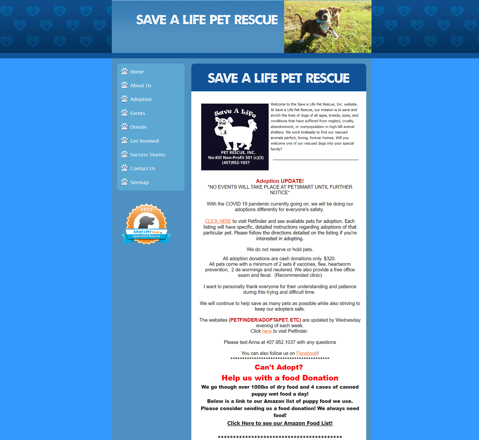
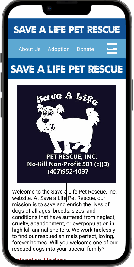
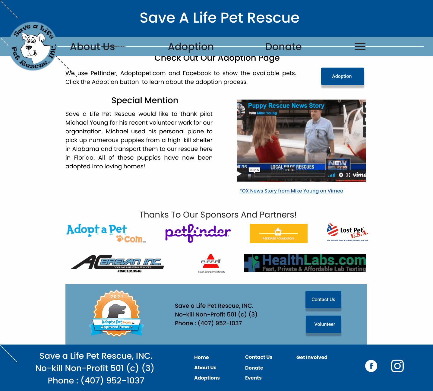
We started off our research by performing our heuristic evaluation on the current website. We noticed that it was just a very long scroll. However its visibility system status is fine, you are to tell what page you are on. Besides that, everything else is poor/dated. There are content that belongs on different pages like for example, the donate button for Amazon is in the Success Stories tab rather being in the Donation tab. I like to call this current website "dated" at best, another one of my group members called it was a flashback to 2003 when websites used to be made in this format.

This is the current website layout, just a massive scroll with content unimportant to the main page that I broken up into 3 different images to prevent the long scroll yourself. This is the start of the main page, a simple layout with a navigation bar on the side, ready to be used. However we noticed that there are multiple font colors which reduces the amount of uniformity this website does have.
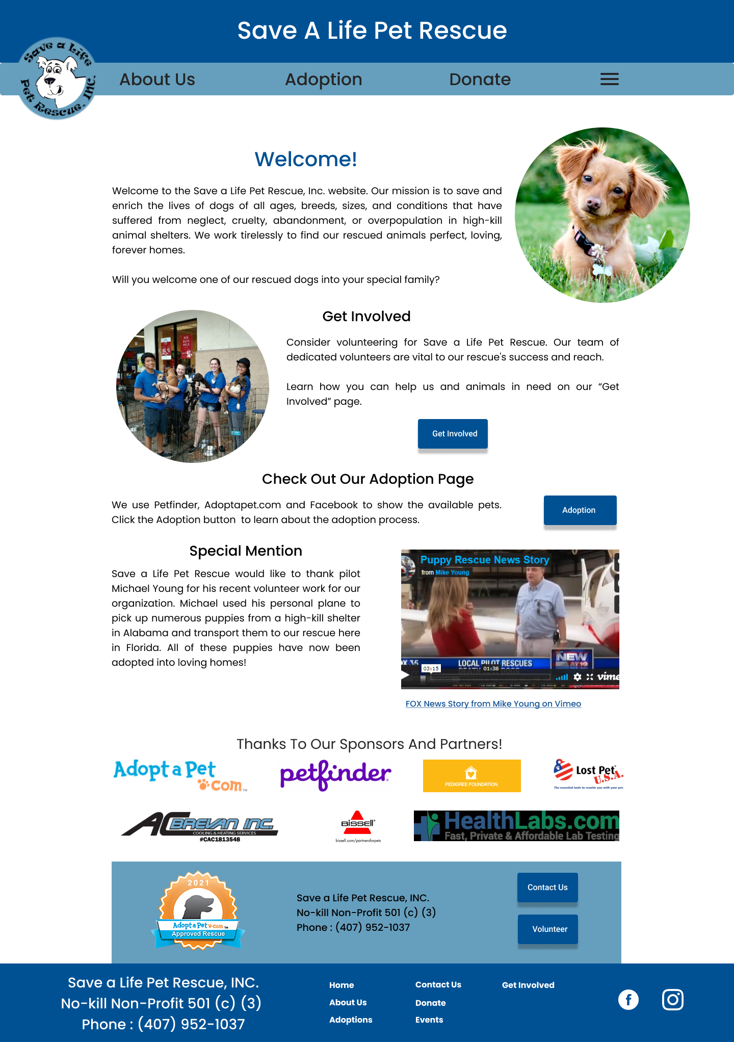
In this section, which is part 2 of home page, there is a random ad for AC installation. We respect that the man did pay for his spot to be there as a proud sponsor, we didn't believe that it is the right place to put someone like him there.
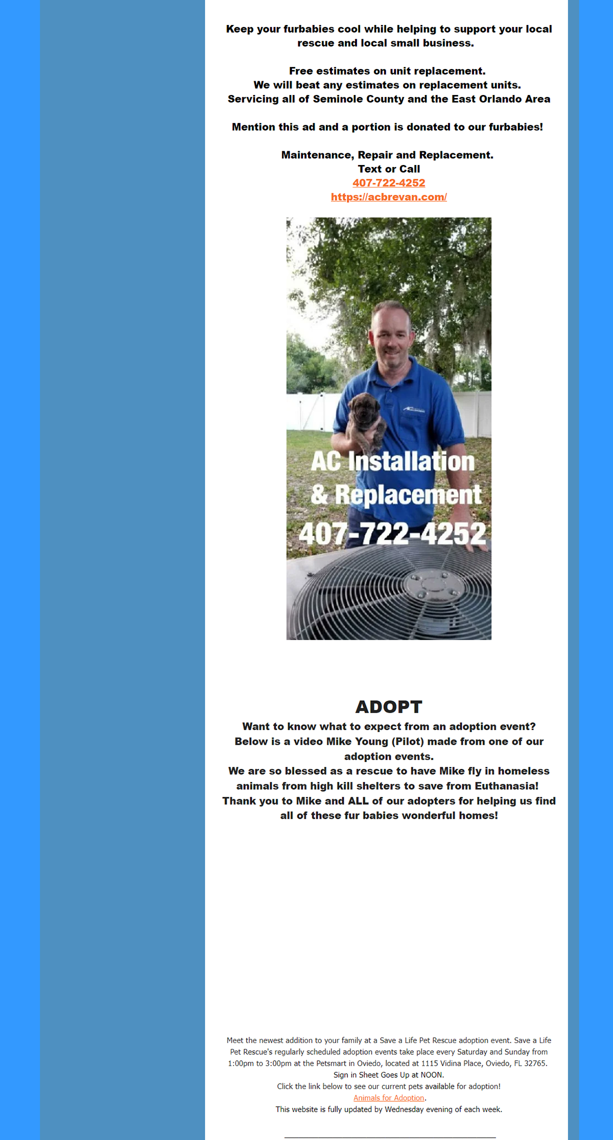
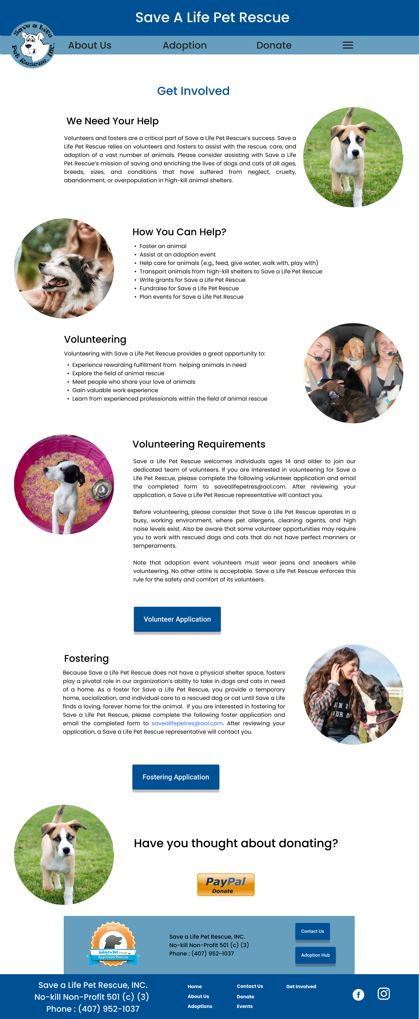
For the Get Involved section, that should be placed in a completely different page for our users to locate and read up or rather it should be simplified in a easier manner. The special mention is a nice tribute and the sponsors at the bottom are nice as well, seeing that you have all these different organizations supporting what this foundation is doing. However through all of this, once again as a reminder, this is all in ONE home page that can be spread out into other pages for the user to see.

To move forward after a snapshot of their heuristics, we did 5 interviews early in our process, unfortunately these interviews were based off of the adoption process. We were originally focusing on the goal to get their animals adopted more but as previously mentioned, they are successful at that goal or metric so to speak.
We had 3 objectives to focus on with our questions which were:
1. Understanding how can we help the nonprofit connect more adoptees with families
2. What is needed to increase the adoption rates in relation to visits to their events
3. How can we understand the reasons behind families choosing to adopt from a local shelter rather than buy from a chain, mill, or breeder
Going from that point, we asked questions such as what are the user's opinion about dogs, have they ever rescued a dog, what would interest them in getting a dog. Then from that point we delved deeper going to the process of adoption, how would it be. What are their opinions of certain dog breeds, what resources do they use in order to continue the process and what standards do they have for the dog(s) they would adopt. We asked a lot about what stops someone or what can help someone adopt a dog in terms of ownership.

Affinity Graph
As we collected our answers from our users, we separated our answers into these categories for the adoption process. Primarily our users gave a lot of thought towards ownership and the adoption process. It turns out that some of our users have had some history of rescuing animals, one of them used to own a dog and explained the process of how they got their dog. Another currently has their dog they took from a rescue shelter which coincidentally was from this foundation! They both stated that their animals have changed their lives. The main reason why people don't get dogs often time is because they don't believe they have the time nor the space to raise animals. Another reason why they don't get a dog is because they often times do not know their medical history and they may not know how to take care of the animal despite trying to give them a second chance to live.
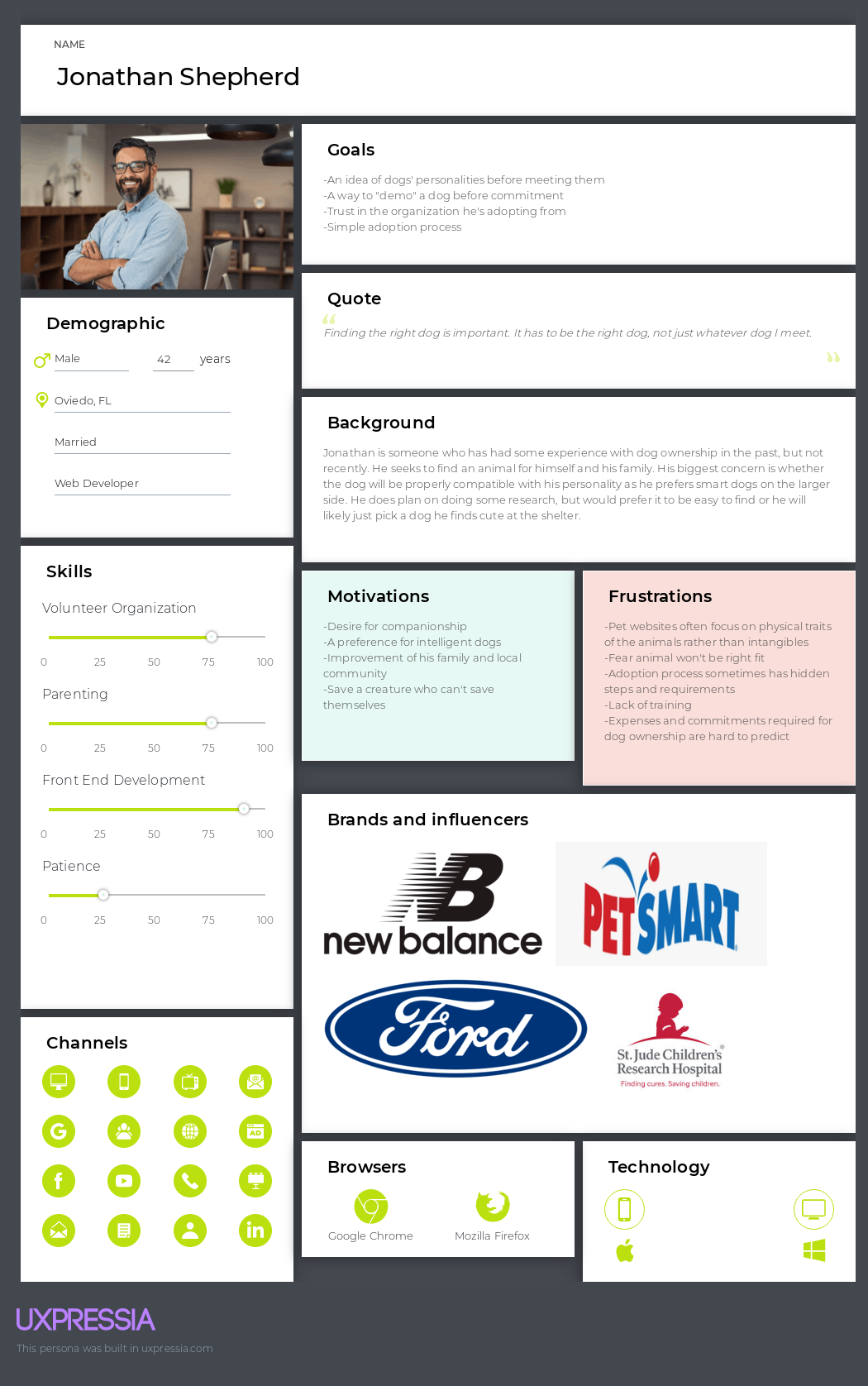
We thought about these things and tried to push forward with the concept for a UI and a experience concept to increase adoption rate. We created a persona out of the results going with Jonathan Shepard. He is an outgoing person who likes to be a family man however he wants to make sure his choices are right for his family in a quick and easy fashion.
A Change of Pace
From this point, after we constructed a persona and doing the interviews about the adoption process. We spoke to the owner, Anna from the foundation and she gave us a different view and we realized what the website tried to do but it made us think it was about the adoption process. We shifted our focus into making the information on this website easier to access and more efficient which could help them get more volunteers and donations. Their system using Petfinder, Facebook and Adoptapet.com are still working great for the adoption process.

Moving onto the value proposition of the foundation. We know that the foundation needs volunteers which needs to be filled out, be taught/trained in animal assistance or they can just donate money or supplies to the organization as they are foster-based foundation. Foster-based foundations are shelters that people share their homes to the animals that need to be adopted, essentially, there is no single shelter that will host all the dogs. The issues we first notice is the little amount of information for users to get involved with the organization on the website, their main source of information is actually on their Facebook page like the rest of their interaction, leaving their website in a derelict state.
We are pushing to bring more transparent information for our users to be involved, focusing on an easier form for volunteers to sign up, notifications on adoption events and a clear donate button/section for our users. We know this organization is different from other shelters in the Central Florida area such as the Animal League and the Pet Alliance of Orlando by focusing on dogs from high-kill shelters, literally saving their lives to give them a new loving home.
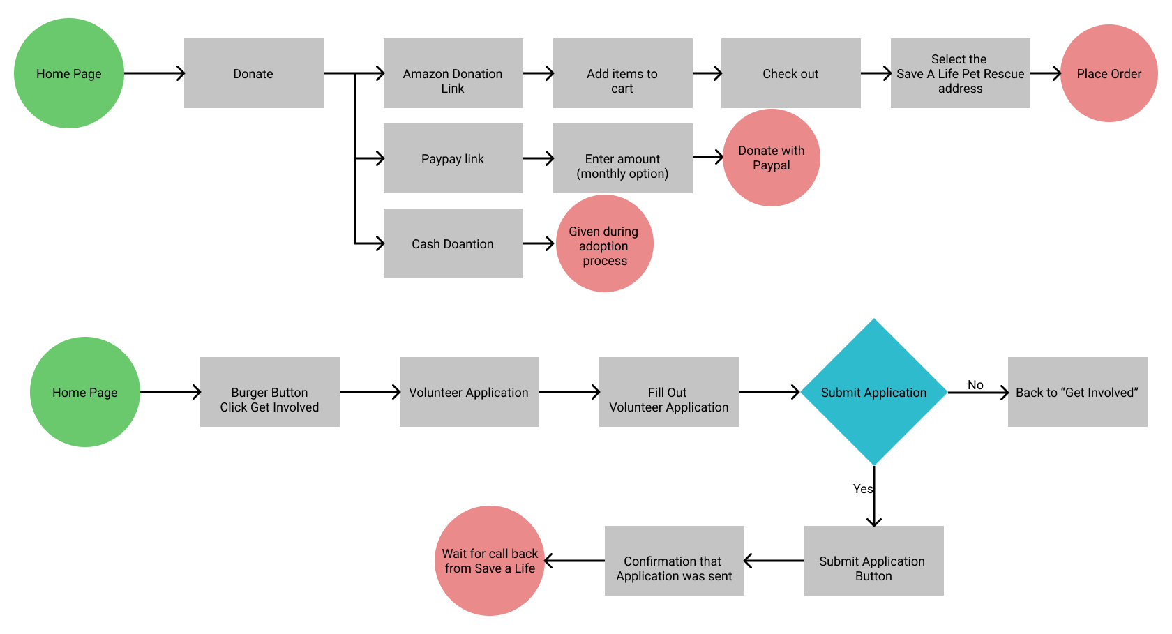
These two flows are what we created for the donation system and also the mobile phone version for volunteers. We saw this as a simplification for our users compared to the old method where we have on the home page in the mobile version "this is how you can help."
Prototyping
With our first round of creating a prototype, we translated the actual website into a mobile browser as the website was not responsive to their dimensions. We created a navigation bar that would be more understandable for our users to go through their website.


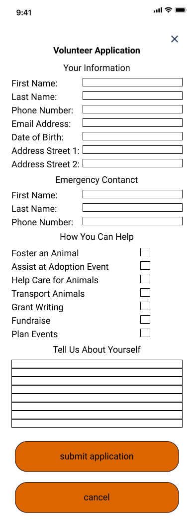
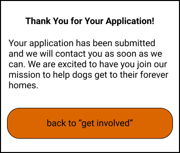
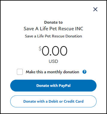
Meanwhile we added some of our own alternations towards the involvement for the organization. Here we simplified the functions for donate and volunteering. We ripped the volunteer form which we found from the the website and created it verbatim. We added a notification for our users to know that it has been submitted and they can continue to search the site. For the donation section, you can choose to donate with their food Wishlist or you can donate actual money as we show the PayPal option more clearly for the user as maybe they don't want to pick out a specific item from the list but rather just give in general to the organization.
Mobile Prototype in Action
User Testing
After having this prototype, we pushed forward with the testing and see what different users thought about our implementation. For everyone, it was clear on what the organization was at the first go which was a success on our part but unfortunately the other parts of their experiences start to go downhill from there. Our users took a while to find what dogs are currently available and they were confused on finding the process to find a dog they're interested in. We then focused on our second task, which was to see if involvement was clear or not within our prototype. They were able to get to the information easily, "complete" the volunteer application, and do a paypal payment. However for 2 of our users, the Amazon button didn't register with the users. Which we determine was a failure.
Overall it did improve the experience for users to by modernizing and making information more accessible but there are some kinks with it. They found that there was too much text on the mobile browser, that we should shift to a more visual concept for our users to use. Our users stated that by having more photos, we'll be able to create a website that is more friendlier and attractive for the user which by secondhand, get them more involved in the concept. Which we translated the mobile design and reiterated on a desktop design for our users.
Below is our improved sitemap before I demonstrate our high fidelity desktop prototype in comparison to the old one. We noticed the homepage is too information heavy, not being able to translate all the links throughout the website itself in comparison to the links we laid out and applied to our redesign.

Comparison of the our reedition of their site map to their current one
Desktop Prototype
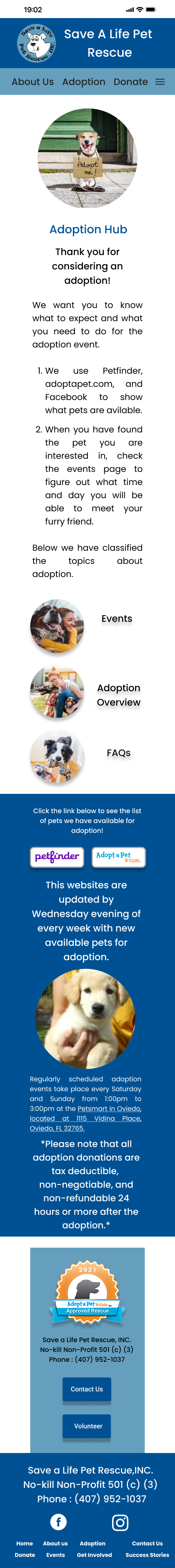
As we push on, we tested our website design again to see how our users would respond. They were able to find things faster and easier for the tasks we gave them, they enjoyed that the font and the image direction was clean and pleasant to use. Some of our users were from the original test so they were pleased with the reduction of text in each of our pages. A small thing they recommended doing is to add a Call to Action to the Adoption Hub page for Petfinder and AdoptaPet.com.

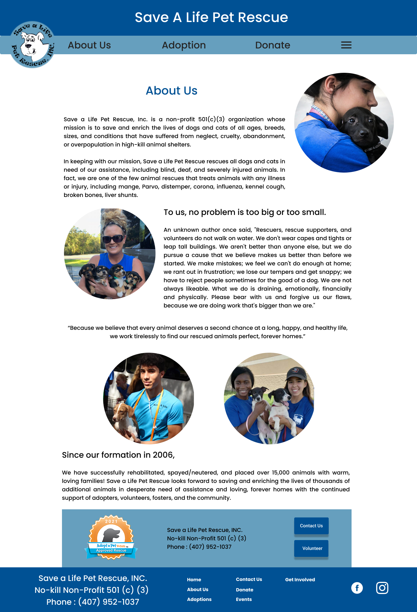
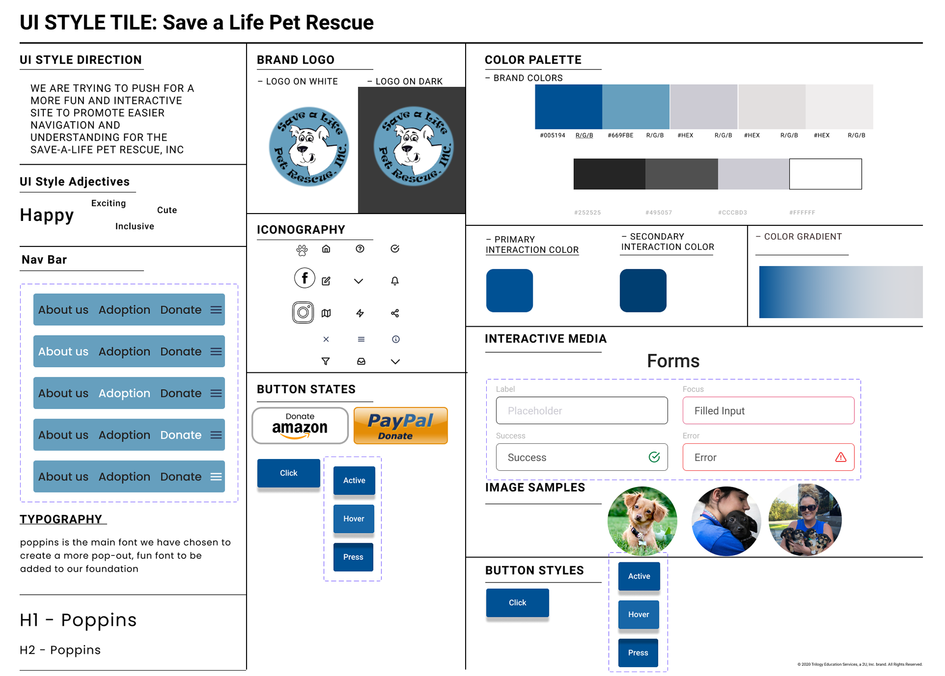
We thought about what will our style guide should be, wondering what themes would be key to keeping as friendly and inviting website for this wonderful organization. We created a style tile, adopting the same colors they use and for headers/larger typography, we used Poppins. We believe that it is a fun and active font which is fitting for a dog rescue organization. We also changed the logo, only using the head of their lovely mascot and add the organization's name around it. As blue is the primary color, we kept to the shades of blue, using drop shadows as a form to show that there are buttons or interactive functions for the user to use. For images, we use circle frames for the nature that it is easier for our users to view and understand but also add a softer and more bubbly feel to our website.
Mobile Hi-Fi Prototype

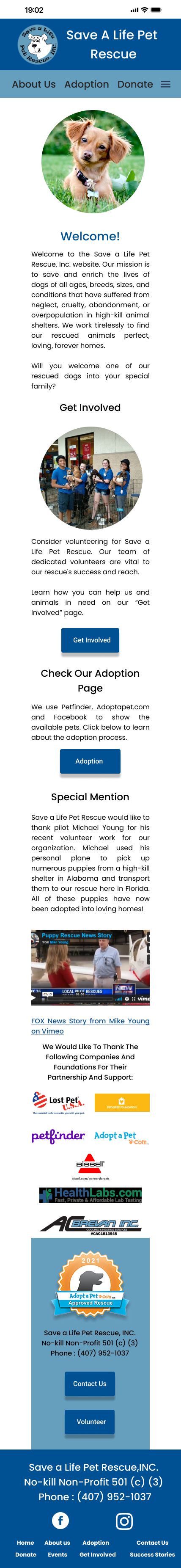
Like what we did in the original concept, we translated our hi-fi desktop prototype to a mobile version, keeping the elements consistent in our style guide and what users liked and enjoyed from our prototype.
Final Prototypes in Action
Desktop Prototype

Final Mobile Prototype
Closing Thoughts
It was rather making something from the ground up as we had to destroy and rebuild a new website altogether. It was interesting to switch the focus of the webpage from being around the animals to being around the actual organization. For this case study, I was able to talk to some of the actual stakeholders to the organization. So in that matter, there was an interesting connection in which they saw the concept as we made it and they were happy with the results, givi9ng back positive feedback and giving us a bit of direction to what they actually wanted with their website. I can say that we did achieve the goal of modernizing the website and in theory, find it easier for our users to get more involved with the organization. I believe things that can be worked on is the volunteer form and breaking that down or even having a "current event" section where they can show the newest batch of dogs they rescue like they do on their Facebook page to show more transparency of information.

Ariel with one of the volunteers of the organization