This case study is based off the current website for the Department of Interior (DOI). The Department of Interior is a part of the US government that monitors America's nature and its resources alongside handling relationships with Native Americans. You may be more familiar with one of their smaller branches, the National Park Service. We have noticed they have recently updated their website but not everything is perfect.
Process
Heuristic Analysis
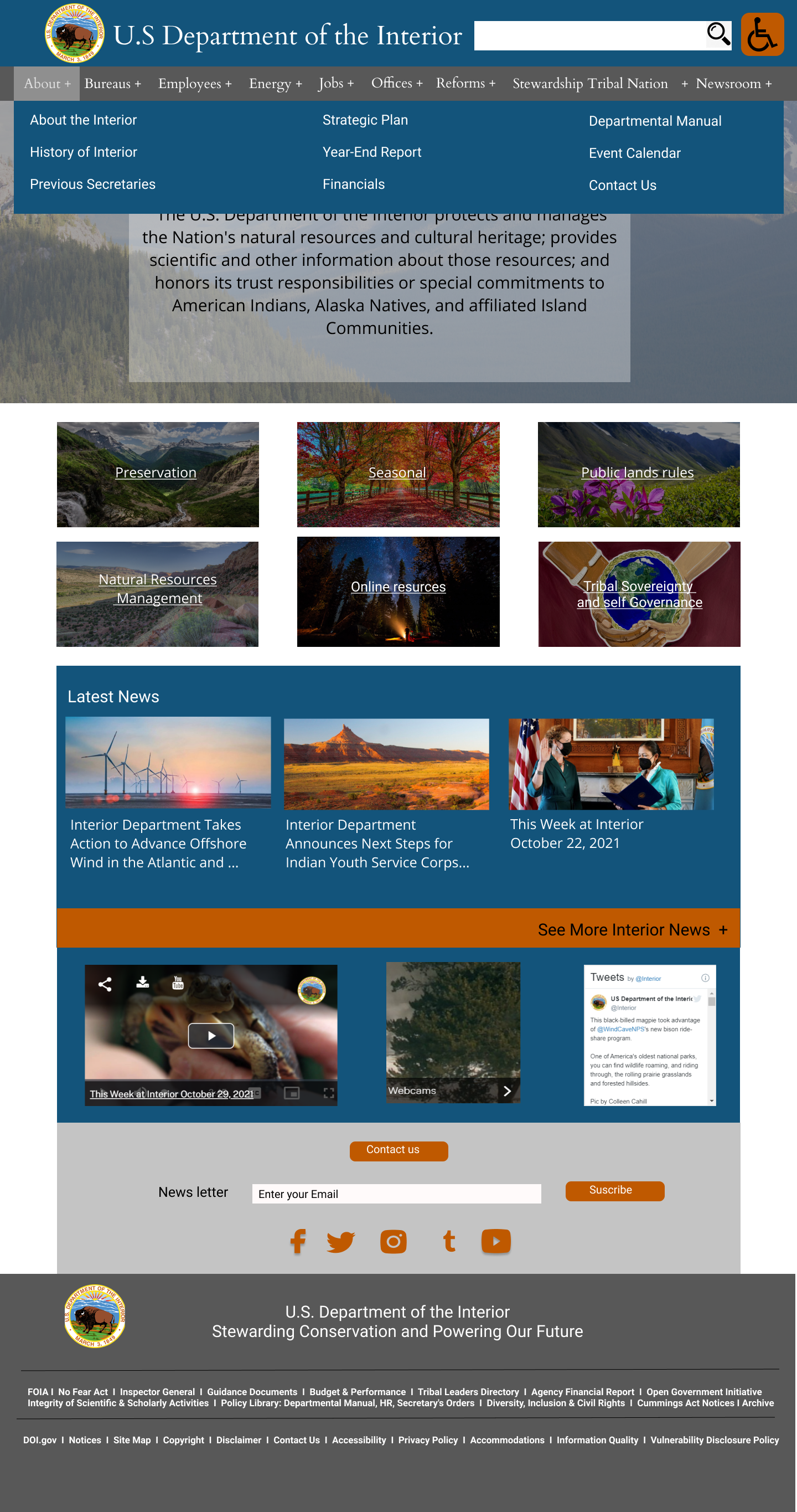
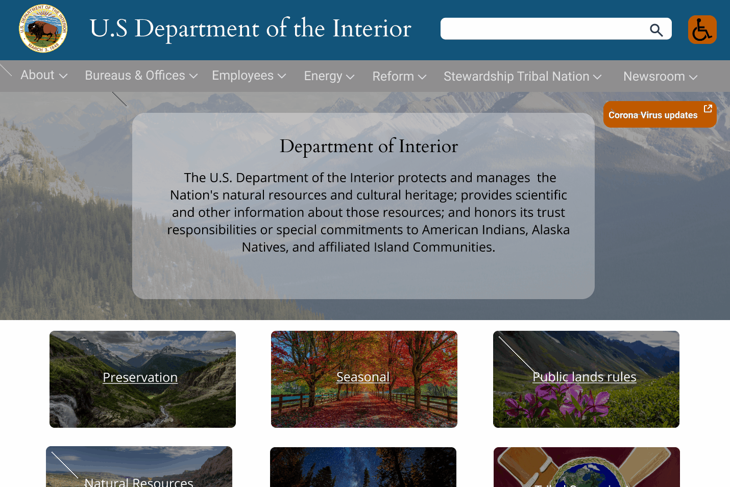
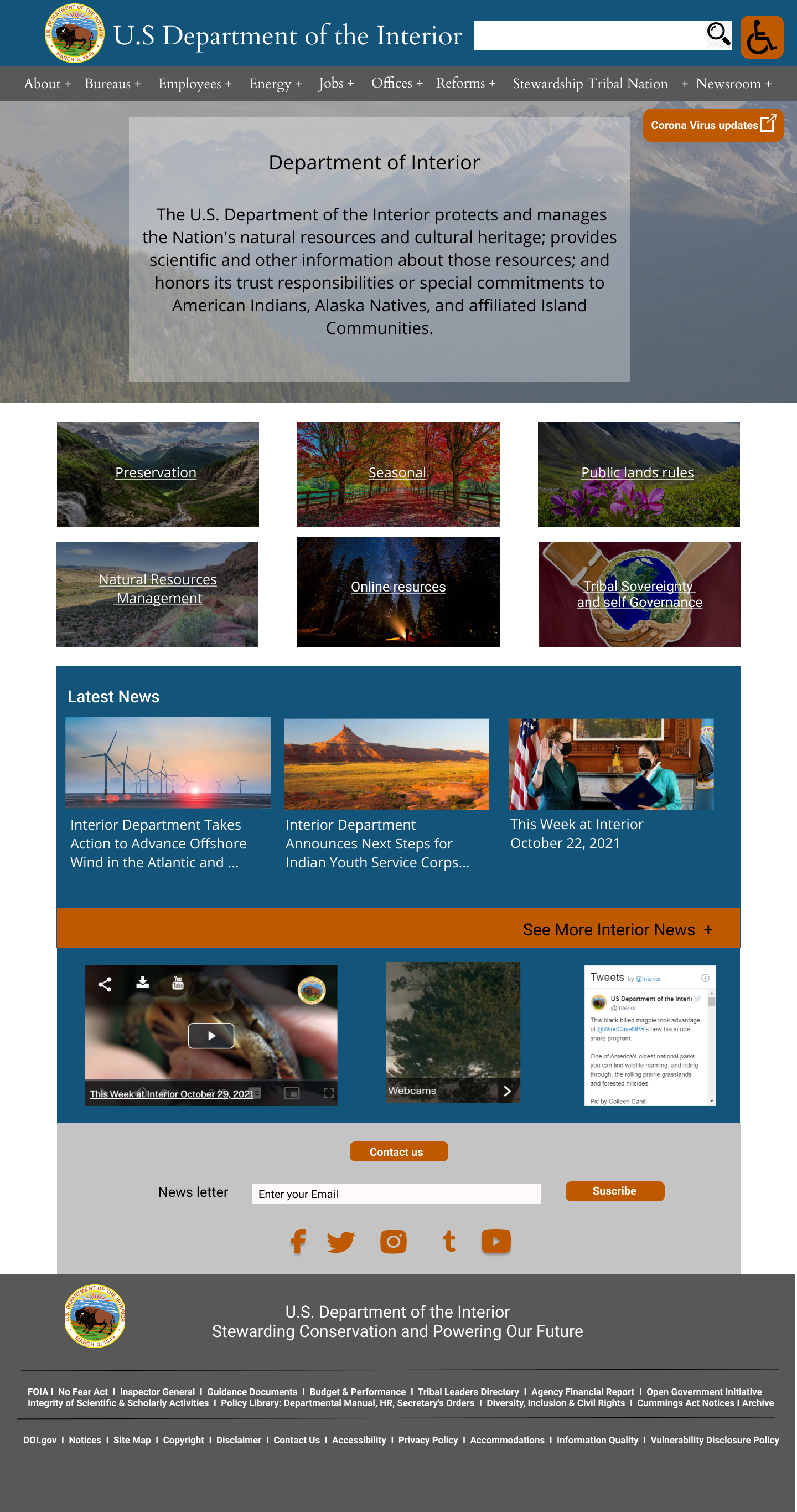
We pushed through with this process by committing a heuristic analysis of their current layout. We noticed that it did have a good color scheme and that their theme was consistent throughout their website. From that point, we think it gets a more trickier as their design isn't simple nor is it clear enough for the user to navigate it. Lastly, the primary goal or purpose isn't defined at all, the images serve a poor image for the user to recognize what the DOI is trying to showcase itself as.

However, there is a huge problem about navigation. It is not consistent, it's hard to come back to the main DOI page from different offices and different parts of the DOI. I had to scroll to the bottom and guess on clicking the DOI logo in the footer to take me back to the homepage. Our main issue with the DOI's navigation is that there was a loose sense of organization that could be optimized a lot better for users.

Lastly, in terms of functionality, at least every page leads somewhere and does not have missing pages. The website loads very quickly, showing a lean design. For employees that aren't exactly trained, they have to dig in the navigation to find "BisonConnect," the DOI's workforce portal.

Annotation


Card Sorting

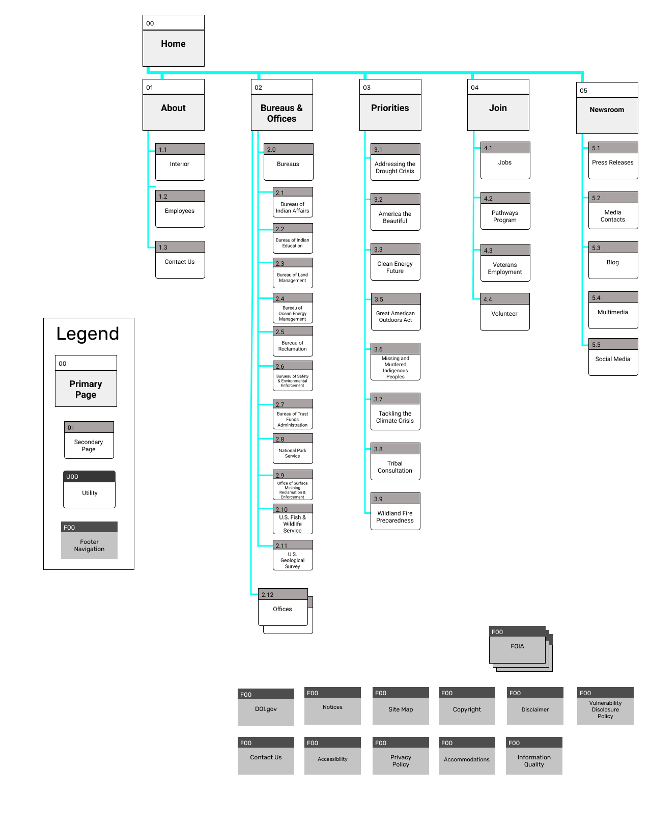
Site Map
From start to the final design
Current

New
UI Elements
Colors
For colors, we did keep the original scheme as it was the strongest point of their current website. We just tested the colors to be more accessible. We noticed in our heuristic analysis, we noticed that they do have a dyslexic function, using OpenDyslexic fonts for them. We wanted to push it a bit farther for color blindness, we just tweaked the colors a bit to prevent those issues from arising as a government website wants to be the most accessible for all forms and ways of life.

Palette Theme

Blue (Primary) Palette

Orange (Secondary) Palette

Dark Gray (Tertiary) Palette

Light Gray (Quaternary) Palette
Typography
We decided to modify the typography a bit, keeping Open Sans and OpenDyslexy. We focused on Cardo to be our header/headings font while we broke it down more, body still continues to be Open Sans and OpenDyslexy to be our accessible font.

Iconography
The main change we made was drop the flickr icon as it's not commonly used or recognized by the vast audience. We unified most of our social media icons by using our orange with the white outlines. All together, our "active" or interactive functions will be in the orange color as it does stick out in the contrast and is the brighter color as our users seem to respond better to that element.

Prototyping
Low Fidelity

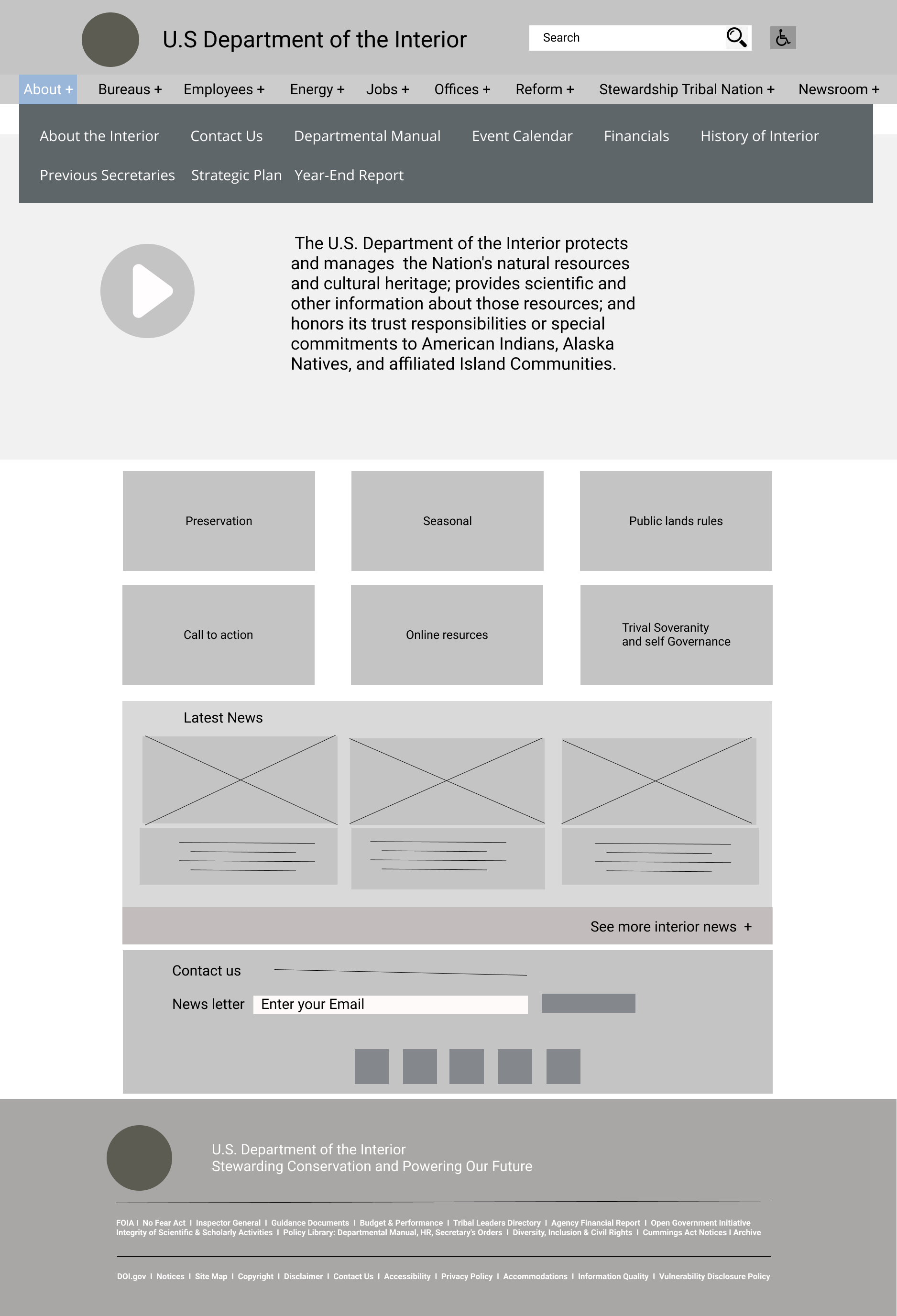


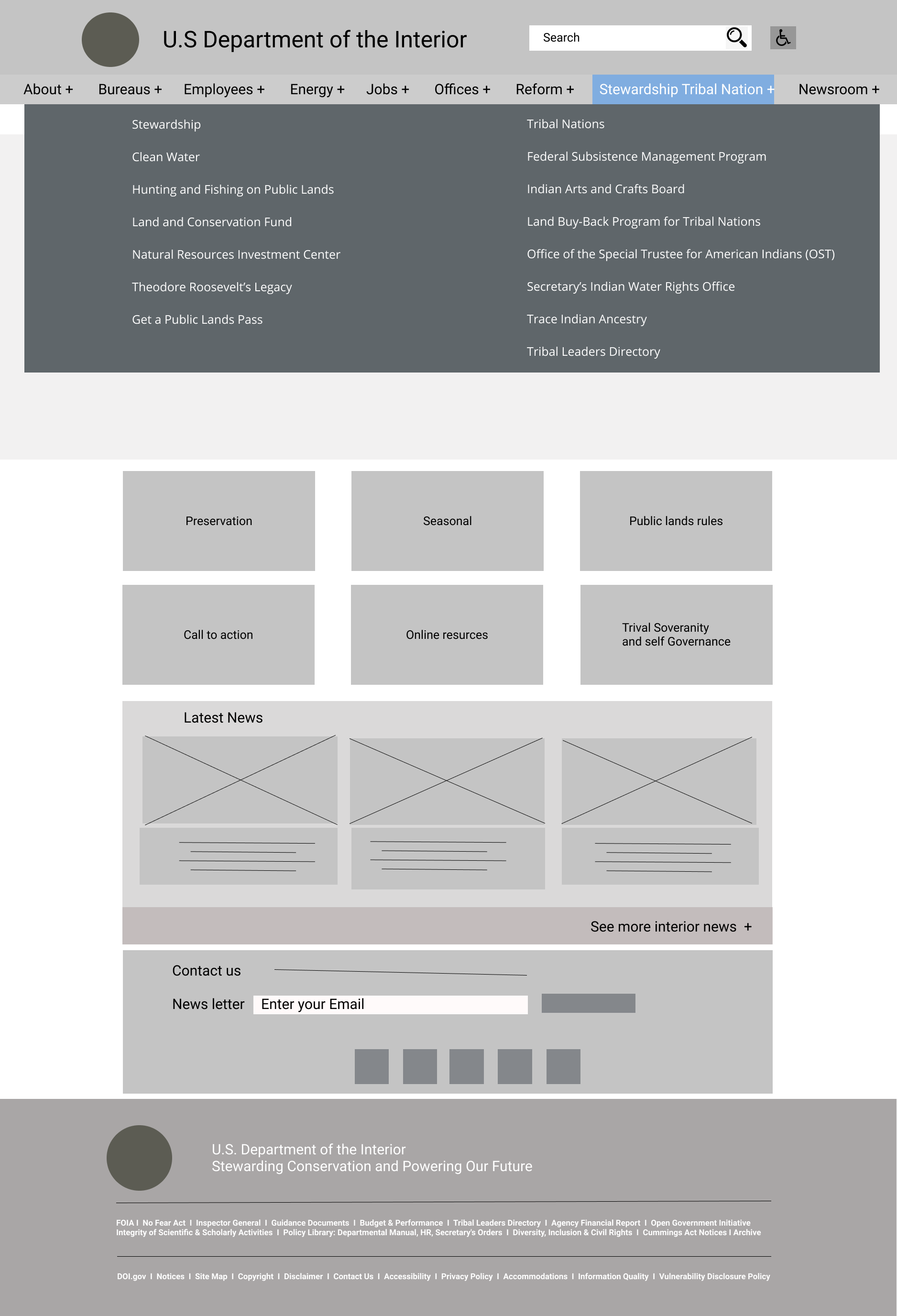

Navigation bar
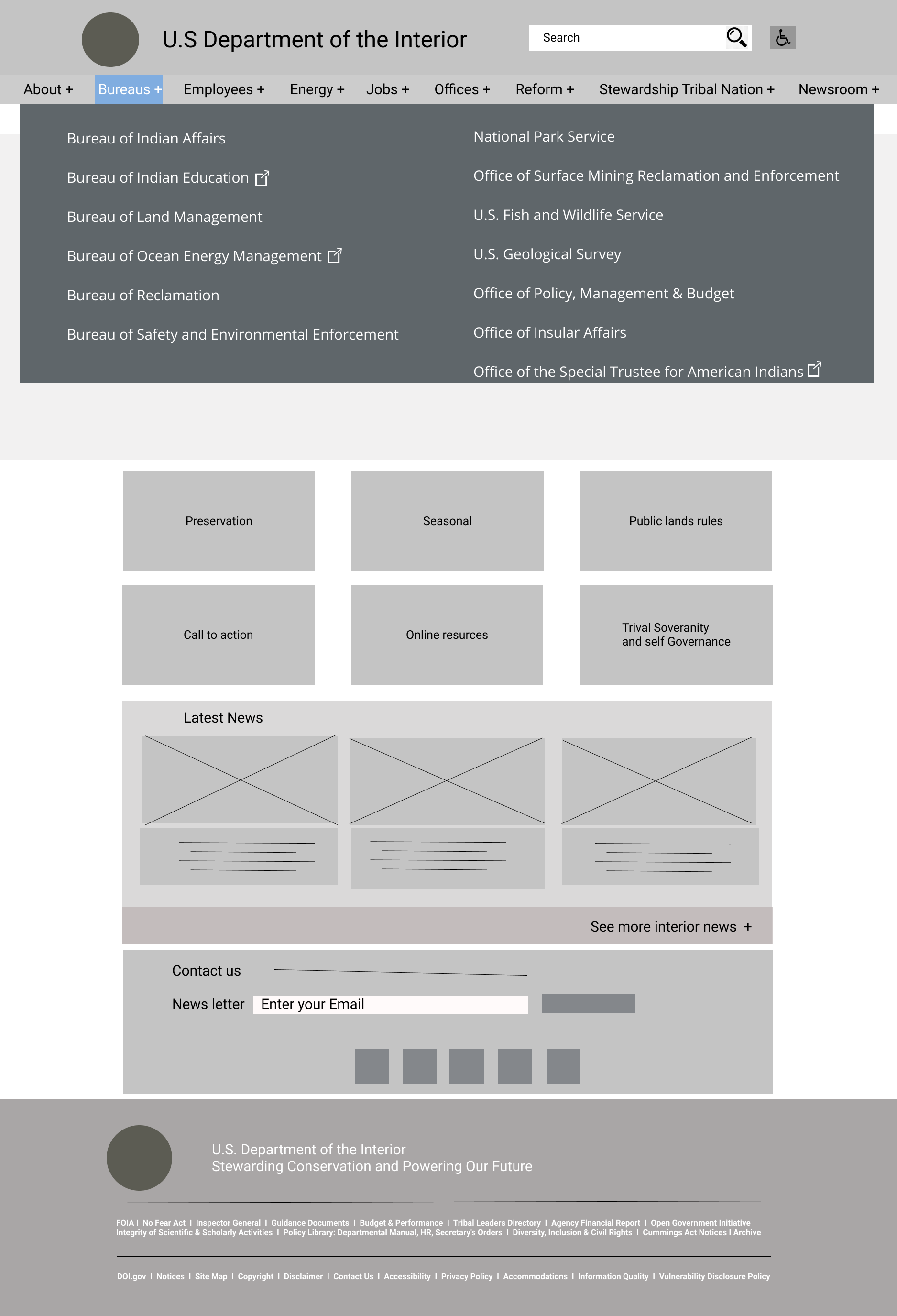
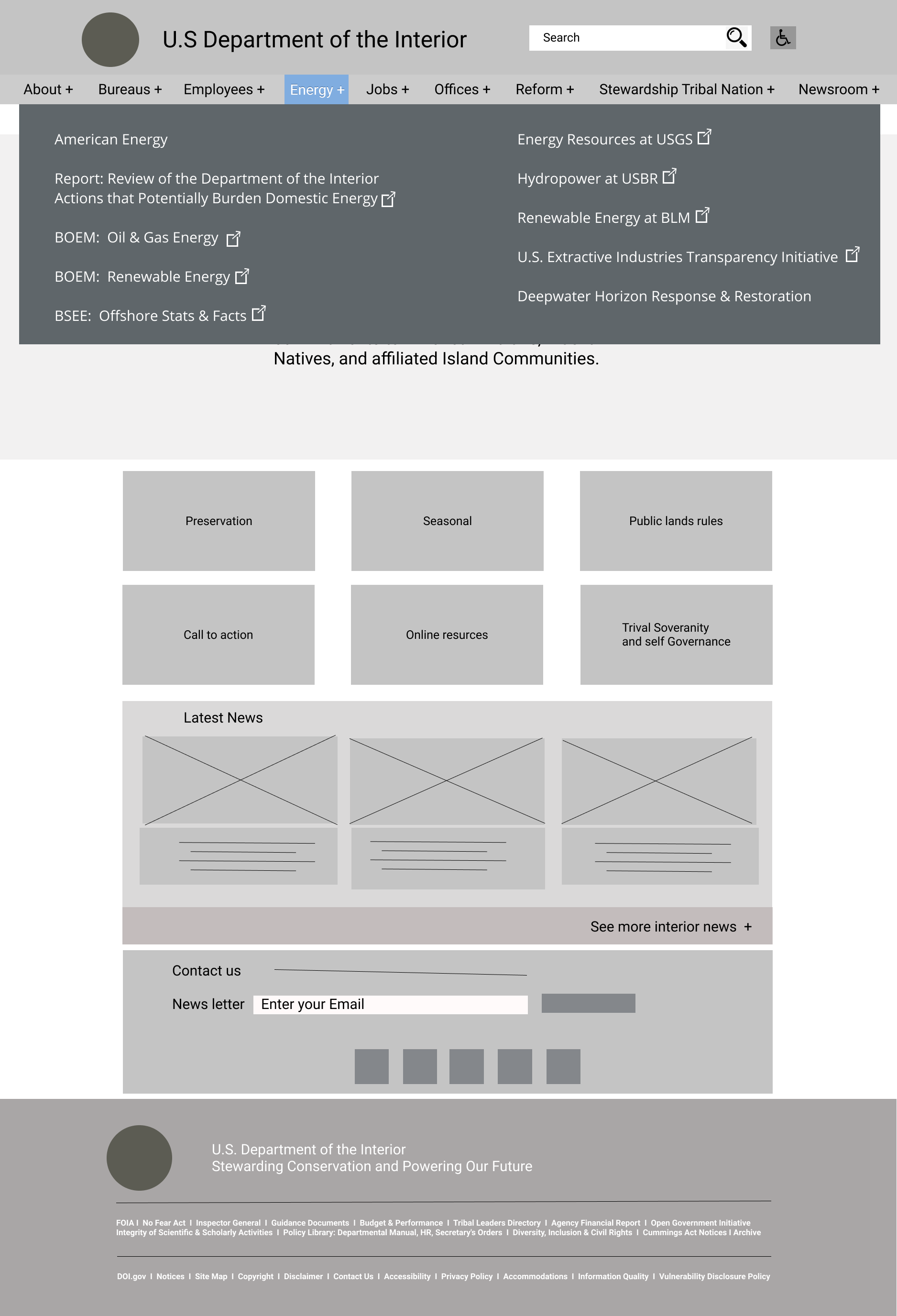
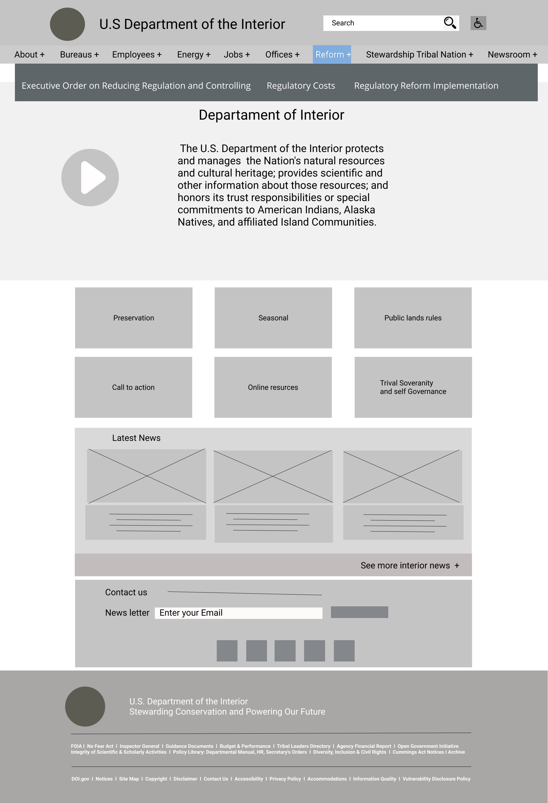
The main thing we improved on is the interface for navigation bar, true it does make more busier but it does use more of the real estate for the topside of the web page, trying to simplify and expand on the options for users to get where they want. A move we pushed for is to separate bureaus and offices into categories: Bureaus, Energy, Stewardship Tribal Nation, and Offices.
Another set of changes we did was adding the different types of users, specifically, for DOI employees, we created its own section under Employees. Newsrooms is meant for those who want to know what is going on with the US' environmental resources where the DOI would post its articles and other newsreels. Besides those points, my group and I were having a debate about the transitions, I believed that the hover function should be instant instead of fading due to responsiveness.

Current Model

Our Redesign
Lo-Fi in Action
Current redesign
Body
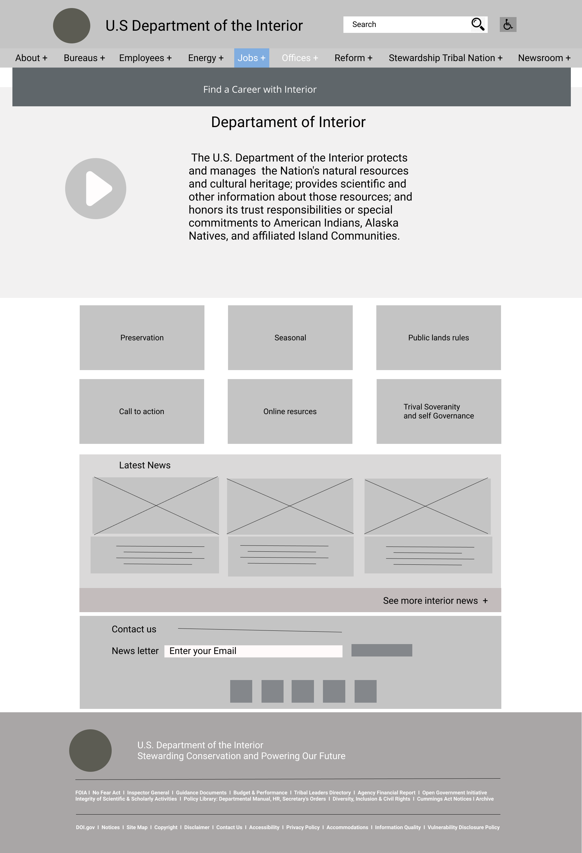
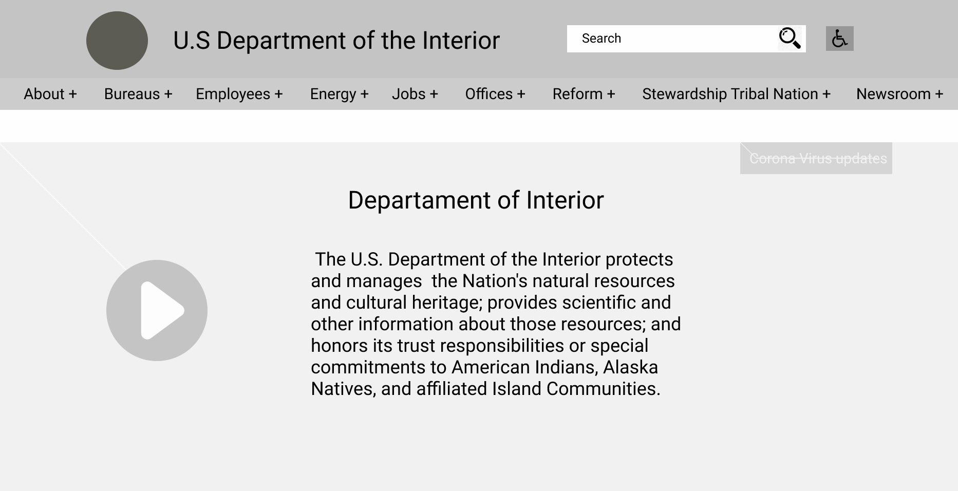
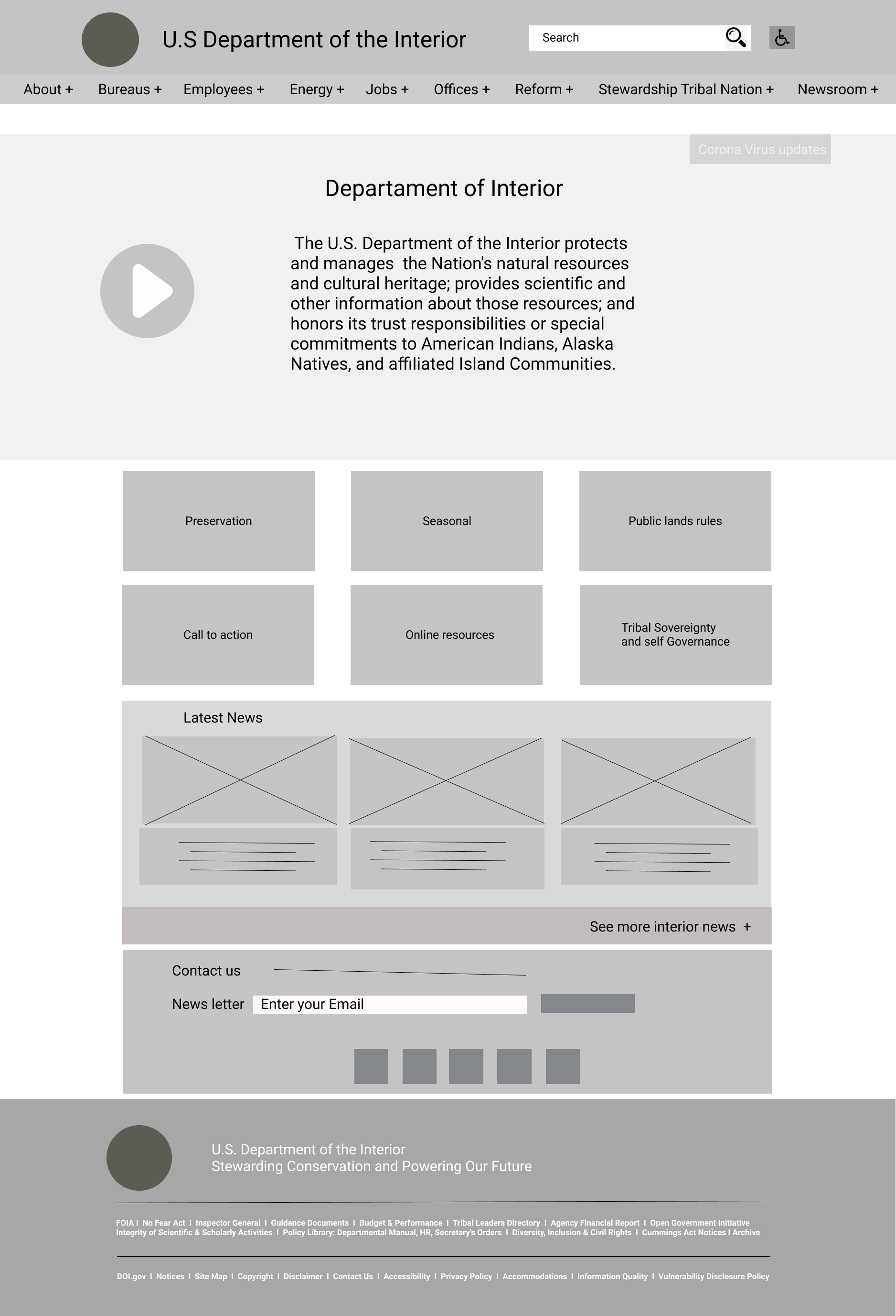
For the rest of the DOI redesign in our low fidelity concept, we removed the overlay square that is currently over the carousel. We added a new section with 2 rows of cards for our users to click on what they want to participate in without wandering around the site in attempt to find what they were locating.
We choose these options because of our primary goals as if we're the DOI but also what someone as a user would want from this website. We figured that users who are familiar with the DOI would be people who like the outdoors such as hikers and environmental activists. Other groups of people would probably be more interested in the Native people, seeing how the government's relationship with them and what options are available for them.
We removed the interactive media in our Lo-Fi because we don't believe that it had a place in our prototype. We found it distracting and removed it. We believed at the time, just having the cards and having the Interior News should be enough for our users to explore on our main page.
Under those sections, we kept the "Subscribe" section to keep the engagement for the DOI but we put blocks underneath the form as social media icons or functions to promote more social interactions through all of their platforms. Besides that, the footer remains the same since it does serve its purpose well enough.

High Fidelity Prototype


Navigation
So as you can see from what we've transitioned to from our testing phase to figure out what our users thought about our navigation interface. We reduced our navigation interface from 9 to 7, reducing the amount of items on the navigation bar. Another thing was a previous argument I had with my group members was resolved as our users did prefer to have an instant reaction rather than the former fading animation we had in the Lo-Fi prototype. That was rather the only major changes, we then took our format and morphed it into Mobile and Tablet versions shown later on in the page.
Application of UI Style Guide
Alongside that you see that our handicap function which what we could only do within our timespan was to switch the fonts for dyslexic people to help them read using OpenDyslexic font. We kept the icons from the top bar all the way down to the subscription section because we believed it makes more sense for our users to scroll through the journey to reach the end which they would be interested in more content from the DOI. From our UI style guide, where we applied our fonts and everything we planned out onto the site to provide more accessibility for our users to engage in. We also changed our plus (+) button to a drop down, indicating to our users that there are more options ready to be selected or seen when you click on the tab. In addition to that, a lot of the links will take you outside the DOI website, we added a symbol that will show the user that they will be taken to another page if they click on that link.
Comparison
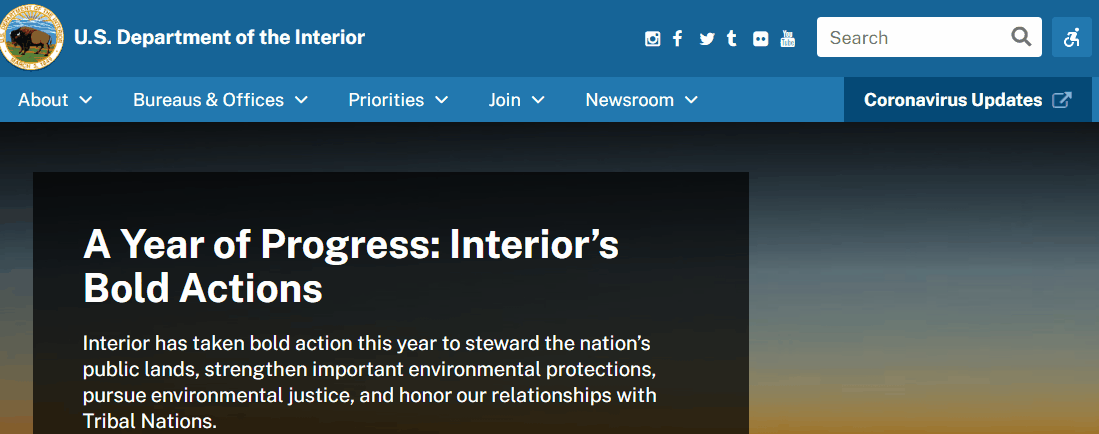
Below here, we have a side by side comparison of our high fidelity to the current website design. As you can see, we use more solid colors to give space and presentation for our latest news and we brought back the interactive media because our users while testing it, stated that they enjoy that aspect. We could think of a better way to use that space for interactive media. I think the twitter box should be removed for another set of content that can be placed there like "Events." Although the twitter box does demonstrate the DOI performing actions, I rather say events would be more popular since people who go on this site would be more interested in participating.
Bonus Versions: RWD Designs
As shown here, we pushed the menu to be a simple hamburger, having the search bar to be the same part of the navigation bar this time. We also put the social icons down at the footer so users who are interested in the DOI, may click on any of the other social platforms it is on and can continue to follow from there.
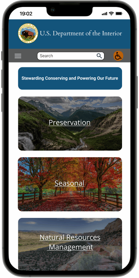
Bonus Mobile Version

Tablet version
Closing Thoughts
I have to admit, the website does run well and we believe as it is a massive overhead for all the other smaller and more popular bureaus and offices, there wasn't much to change besides the navigation which was the biggest offender to us. This project took about 3 weeks to finish and from my own personal experience, I had a lot going on and I was adapting to my new time management. I was able to work with my group members and we found a rhythm to work with. I thank them for being understanding while I had to focus on myself and to see what I could do with this task from my reduction of free time due to the events in my life. We prioritized on the navigation primarily because we found ourselves often getting lost when we go to another page or go where we wanted to go and then turn back. It was messy on our end and we organized everything and split everything into groups so we can make the site more easier and understandable to the average user. It was rather difficult to organize it as well because of the different groups of users, may they be employees of the DOI, Native Americans needing to use the government site for their own policies, environmentalists who wish to see how the DOI is applying its power to America's natural world, or perhaps, hikers or people who enjoy the outdoors who end up being curious. We try to organize the site the best way we can for all these different groups of people who would interact with the website.